Emagister UI Overhaul
As Design and Usability Manager
Emagister is one of the internet’s leading education and training directories, with 11 country websites, over a million courses and around 2 million visitors per month on average throughout the year.

The Challenge
Emagister had an urgent need to increase organic traffic and product engagement on its platform to better meet Google’s most recent changes in its algorithms, which championed unique content and user experience.
To learn more about this challenge, I reviewed existing data and conducted new search which, when combined, identified:
- The most promising areas to develop unique content for in Emagister’s course descriptions.
- An acceptable benchmark to achieve WCAG Level AA accessibility compliance.
- The most fertile areas in which a stronger and renewed brand positioning could positively influence e-commerce performance.
The Opportunity
I presented my findings to senior leadership, who agreed that a step-change in user experience, together with a brand refresh, had the best chance of energising the wider team around the desired business outcomes of increasing traffic to the platform, as well as transforming our UX practice to meet global usability and accessibility standards.
For this, I was trusted to manage two projects:
- A new Design System and platform UI overhaul that would apply the new visual language, meeting our usability and accessibility goals.
- A brand repositioning, which would ensure optimal emotional and rational resonance with Emagister’s audiences (read the full Case Study here) throughout the end-to-end user journey.
The new UI and brand would then be launched together.
My Role
For the UI overhaul and new Design System, I took the following actions:
- Articulated the new vision with the Product, Engineering, Sales and other teams to reinvigorate the company’s sense of purpose, build enthusiasm and ensure alignment.
- Co-owned the UI Overhaul Roadmap with senior leadership, in closest collaboration with PM, Engineering and IT, to guarantee commitment.
- Assembled and mentored a cross-functional team of analysts, designers, copywriters, creative technologists and accessibility experts—a mix of existing and new hires—to spearhead the efforts and build a strong, internal sense of ownership.
- Project-managed the Design pipeline.
- Directed UX Design, Visual Design and Content Design efforts to ensure alignment with the new brand vision and ensure accessibility.
- Fostered close, individual relationships between Analysts, Designers and Engineers to encourage independent, proactive ownership of project goals.
- Ensured timely delivery to the Central Engineering team in charge of integration and launch to guarantee a strong shared sense of accomplishment.
Results and Impact
The project delivery included:
- Over 220 new design tokens for all interface elements: structure and layout, colour and typography, basic UI elements, patterns and content components.
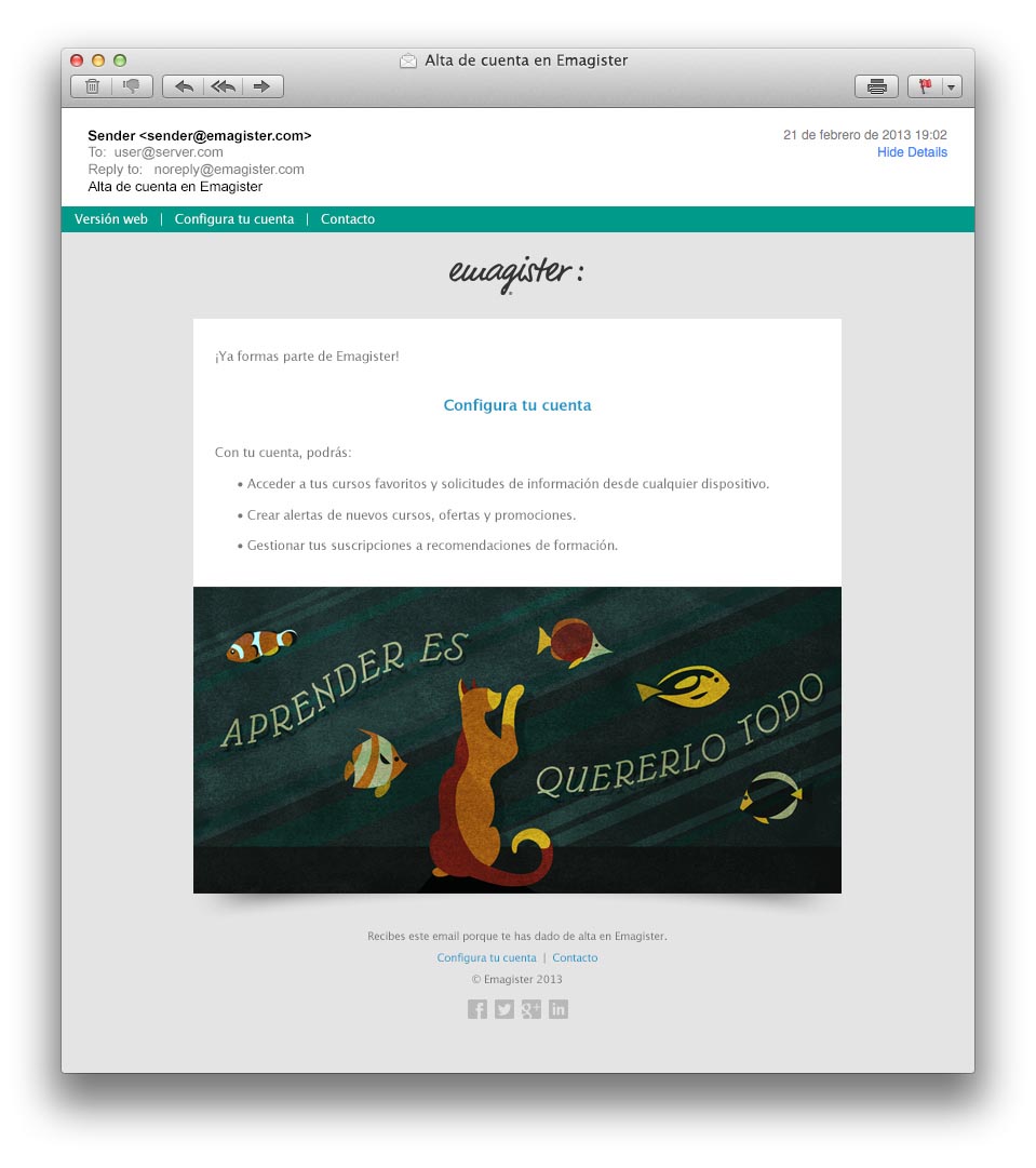
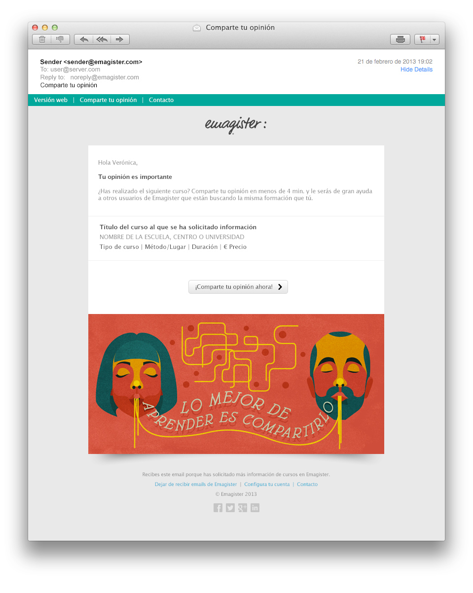
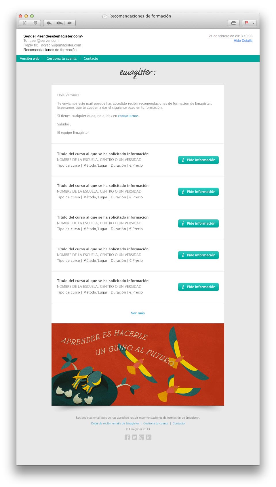
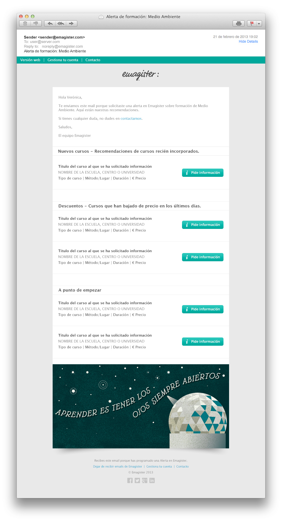
- Over 30 redesigned page, modal and email templates leveraging the new Design System
- Over 50 new, modular visuals to leverage throughout the user journey.
Business outcomes within the first 3 months of launch included double-figure increases in:
- Organic and non-organic visits thanks to better SEO performance.
- Bounce rate reduction thanks to more and better key information at the top of the page.
- Average session time thanks to improved usability and accessibility.
- E-commerce transactions thanks to better layout, UI components and increase in brand trust.
Proposed Solutions
I presented my findings to senior leadership, who agreed that a step-change in user experience, together with a brand refresh, had the best chance of energising the wider team around the desired business outcomes of increasing traffic to the platform, as well as transforming our UX practice to meet global usability and accessibility standards.
For this, I was trusted to manage two projects:
- A new Design System and platform UI overhaul that would apply the new visual language, meeting our usability and accessibility goals.
- A brand repositioning, which would ensure optimal emotional and rational resonance with Emagister’s audiences (read the full Case Study here) throughout the end-to-end user journey.
The new UI and brand would then be launched together.
My Role
For the UI overhaul and new Design System, I took the following actions:
- Articulated the new vision with the Product, Engineering, Sales and other teams to reinvigorate the company’s sense of purpose, build enthusiasm and ensure alignment.
- Co-owned the UI Overhaul Roadmap with senior leadership, in closest collaboration with PM, Engineering and IT, to guarantee commitment.
- Assembled and mentored a cross-functional team of analysts, designers, copywriters, creative technologists and accessibility experts—a mix of existing and new hires—to spearhead the efforts and build a strong, internal sense of ownership.
- Project-managed the Design pipeline.
- Directed UX Design, Visual Design and Content Design efforts to ensure alignment with the new brand vision and ensure accessibility.
- Fostered close, individual relationships between Analysts, Designers and Engineers to encourage independent, proactive ownership of project goals.
- Ensured timely delivery to the Central Engineering team in charge of integration and launch to guarantee a strong shared sense of accomplishment.
Results and Impact
The project delivery included:
- Over 220 new design tokens for all interface elements: structure and layout, colour and typography, basic UI elements, patterns and content components.
- Over 30 redesigned page, modal and email templates leveraging the new Design System
- Over 50 new, modular visuals to leverage throughout the user journey.
Business outcomes within the first 3 months of launch included double-figure increases in:
- Organic and non-organic visits thanks to better SEO performance.
- Bounce rate reduction thanks to more and better key information at the top of the page.
- Average session time thanks to improved usability and accessibility.
- E-commerce transactions thanks to better layout, UI components and increase in brand trust.
Design System
Over 200 new design tokens were defined and delivered to the engineering team, who participated actively in their definition.
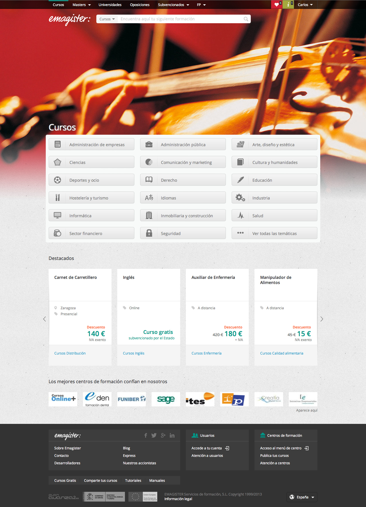
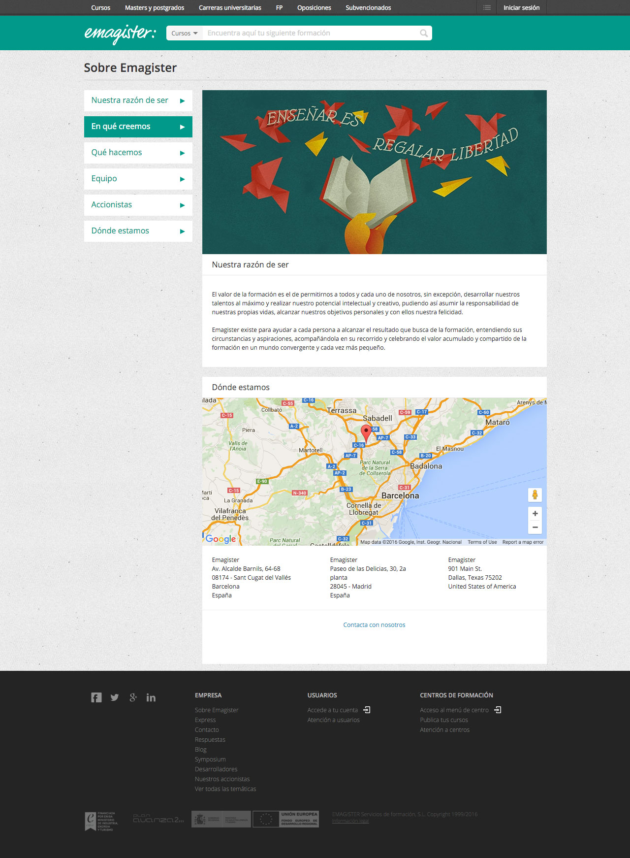
New Key Page Templates: Home and Company Information
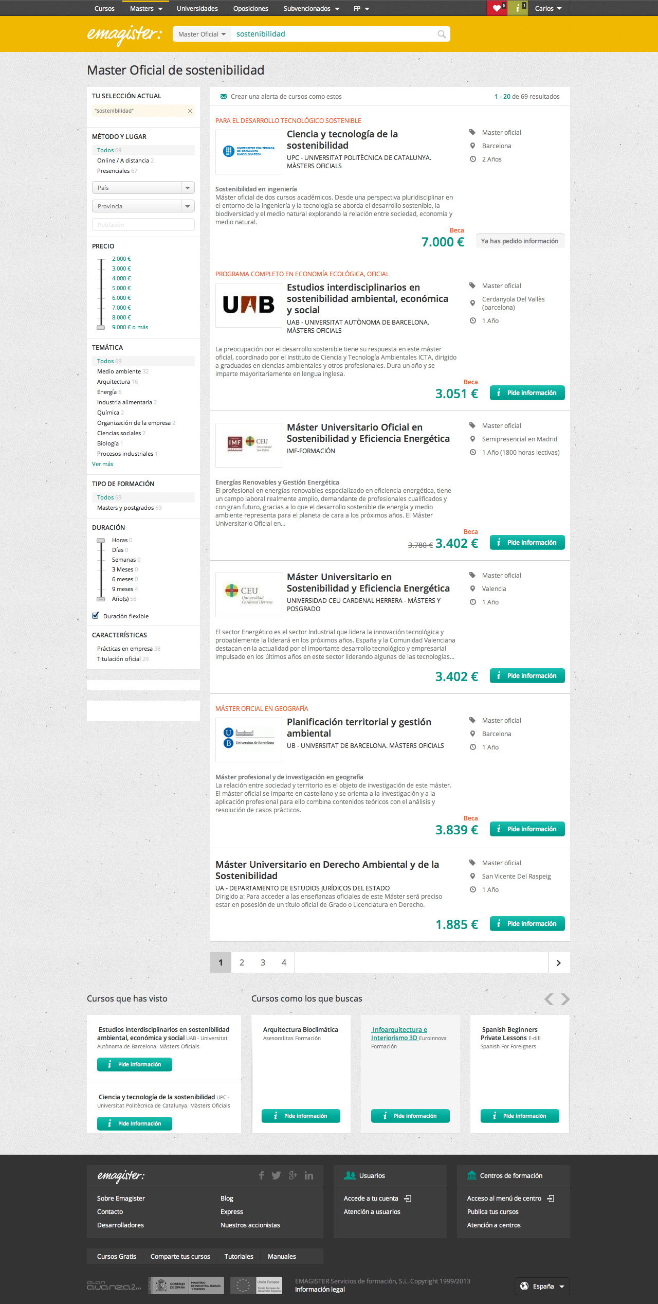
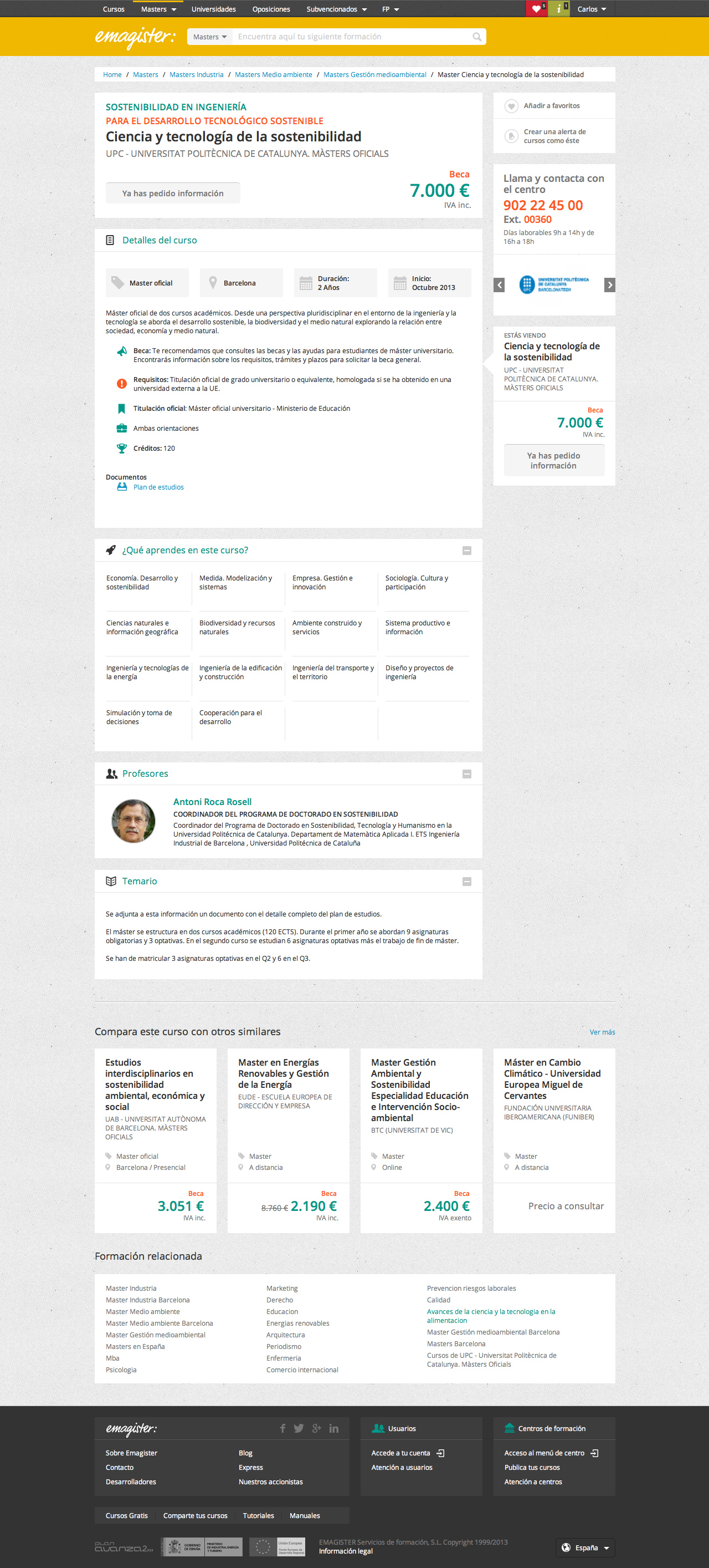
New E-commerce Page Templates
Emails