Galapagos National Park Brand
About this Work
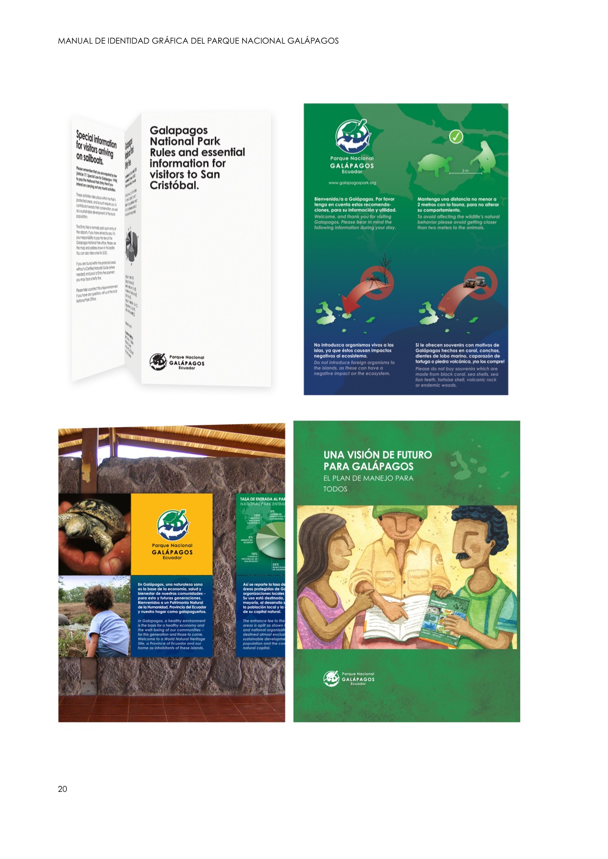
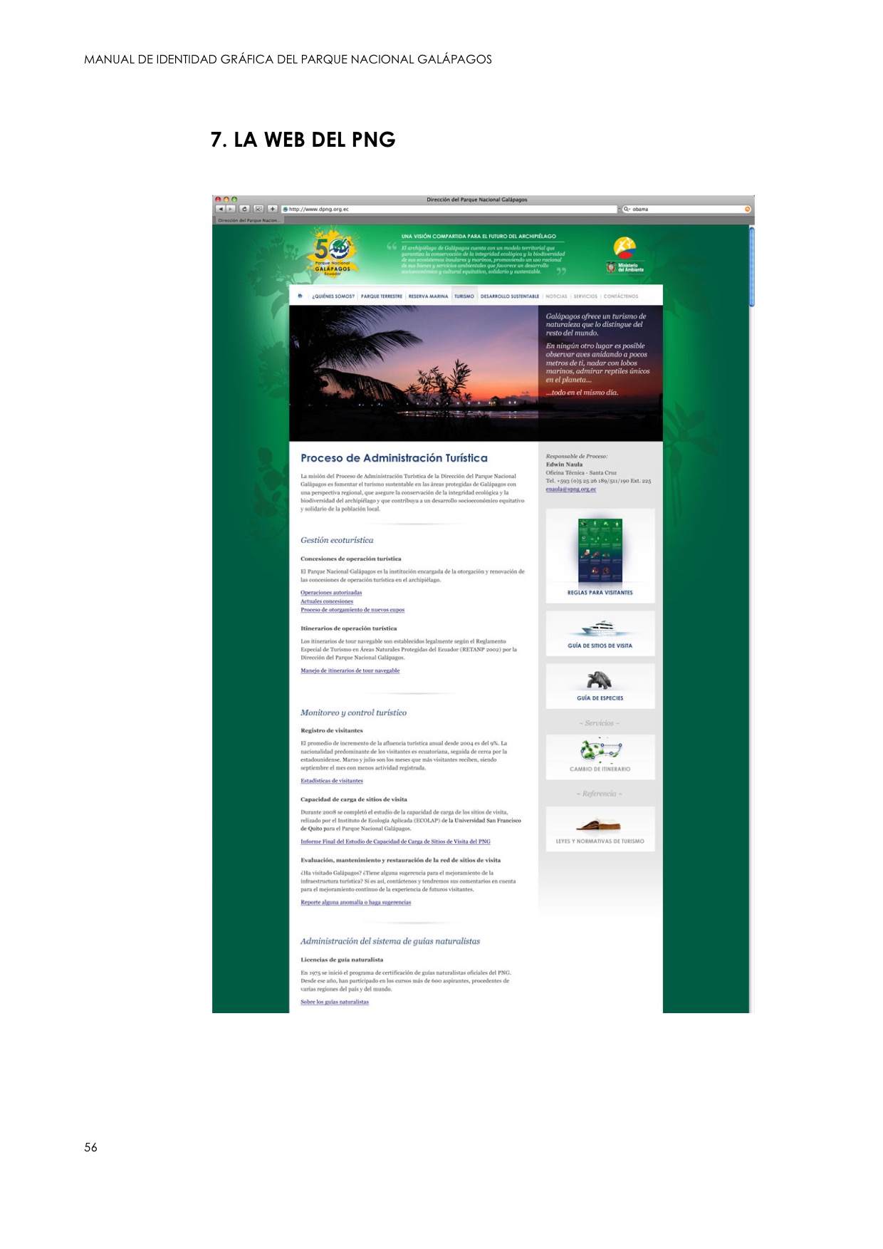
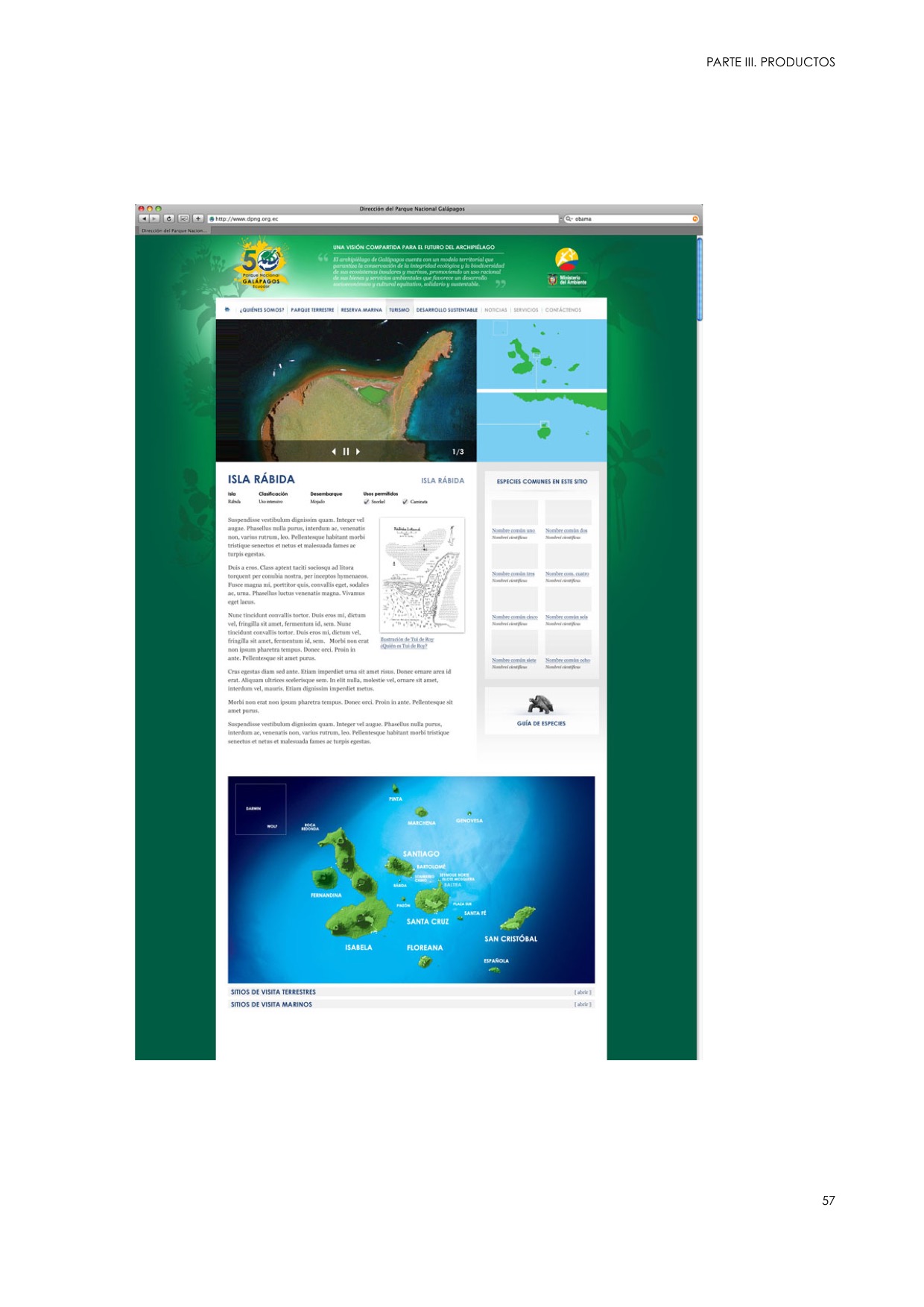
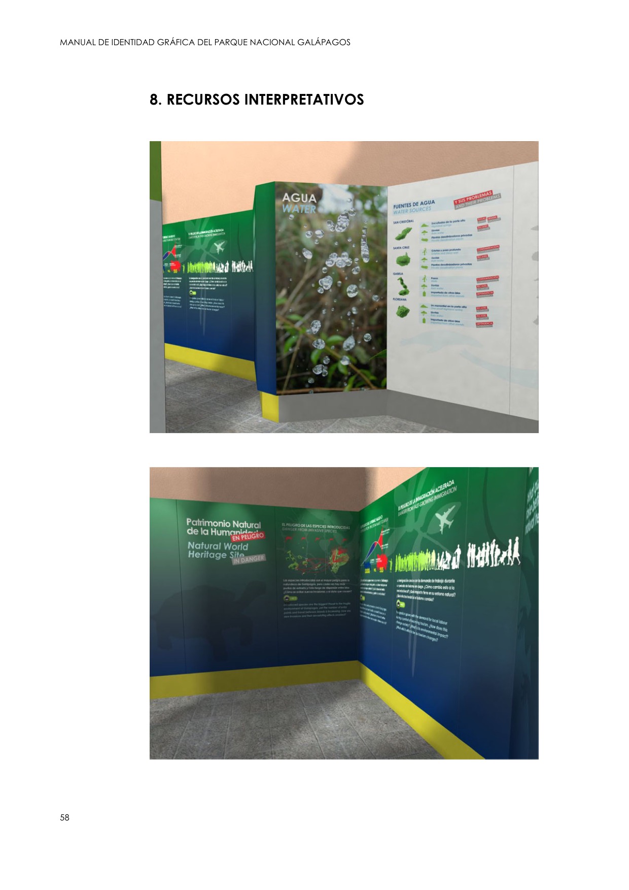
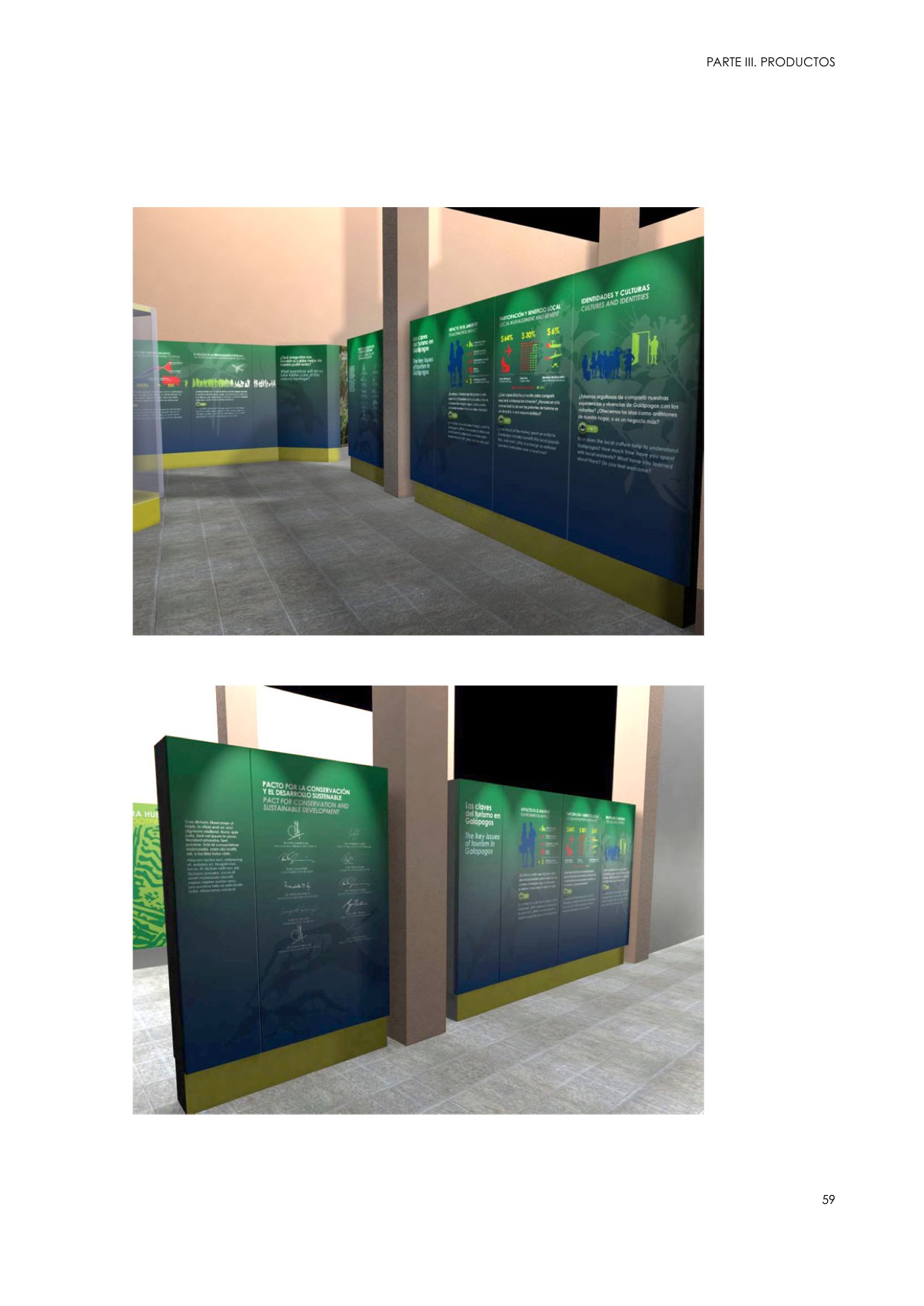
As part of the implementation of the Galapagos National Park Service’s new Communication, Education and Participation Strategy, I wrote and designed some of the first communication products that included the new vision for conservation in Galapagos, in which the local communities are included.
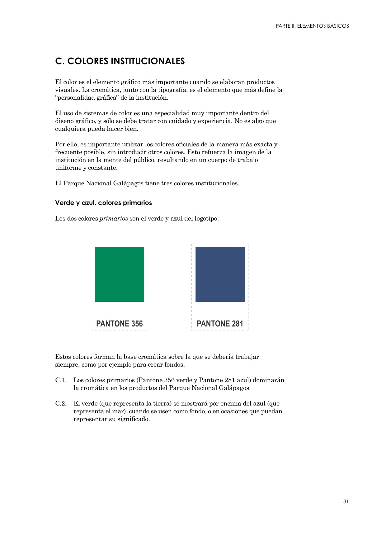
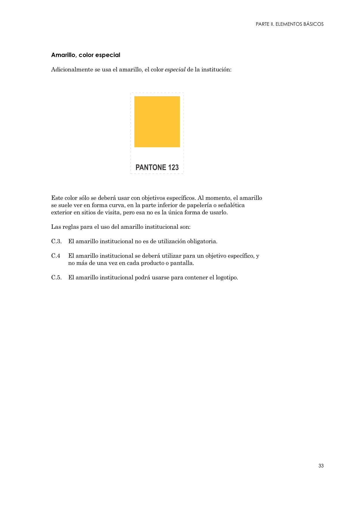
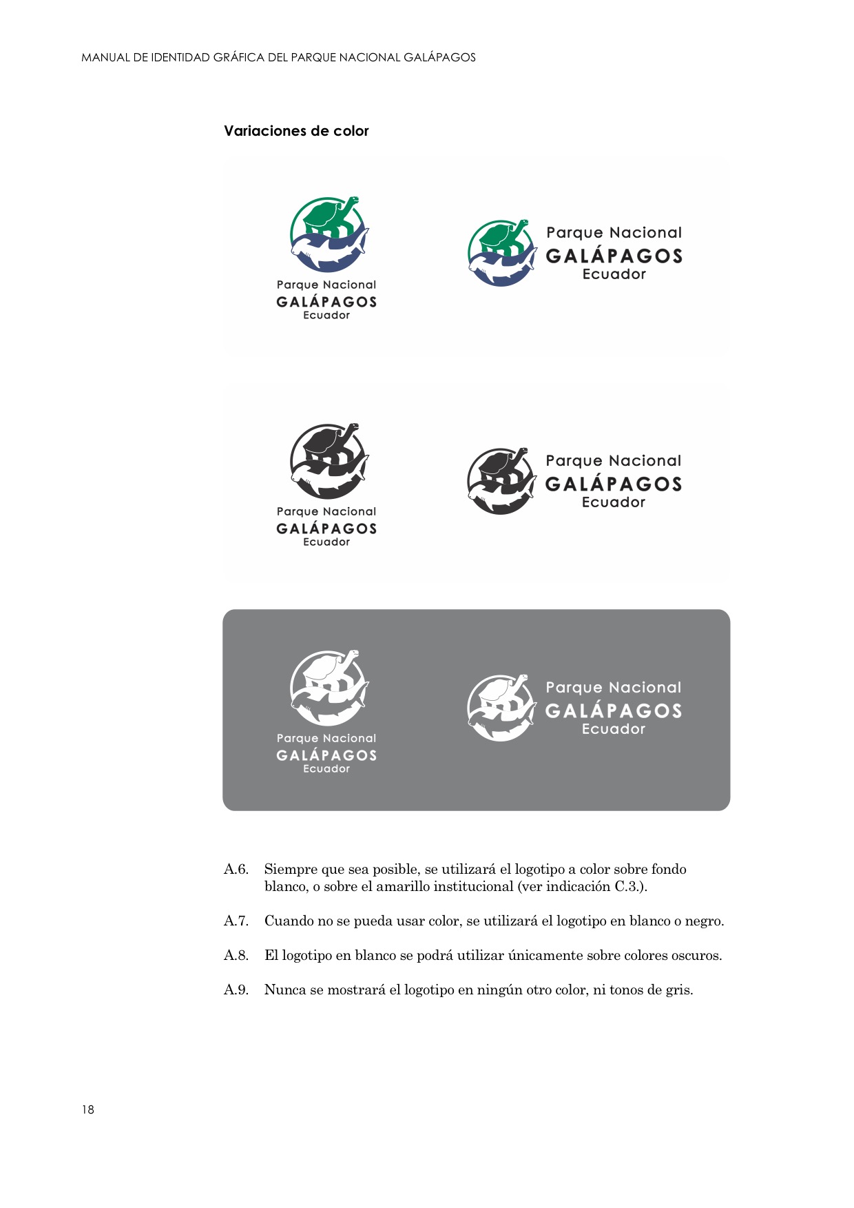
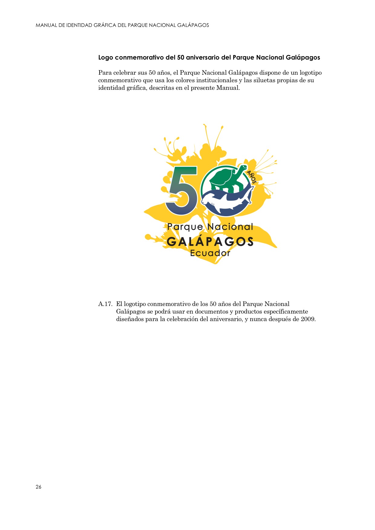
During this process, I consolidated the Park Service’s graphic identity, which already had a new logo and a set of corporate colours, but not much more.
My Role
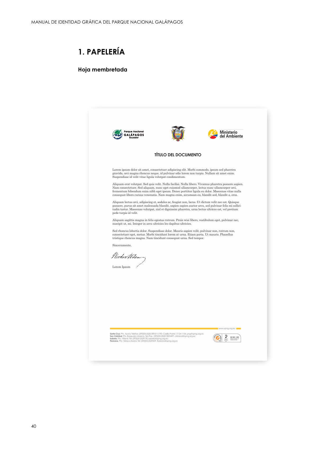
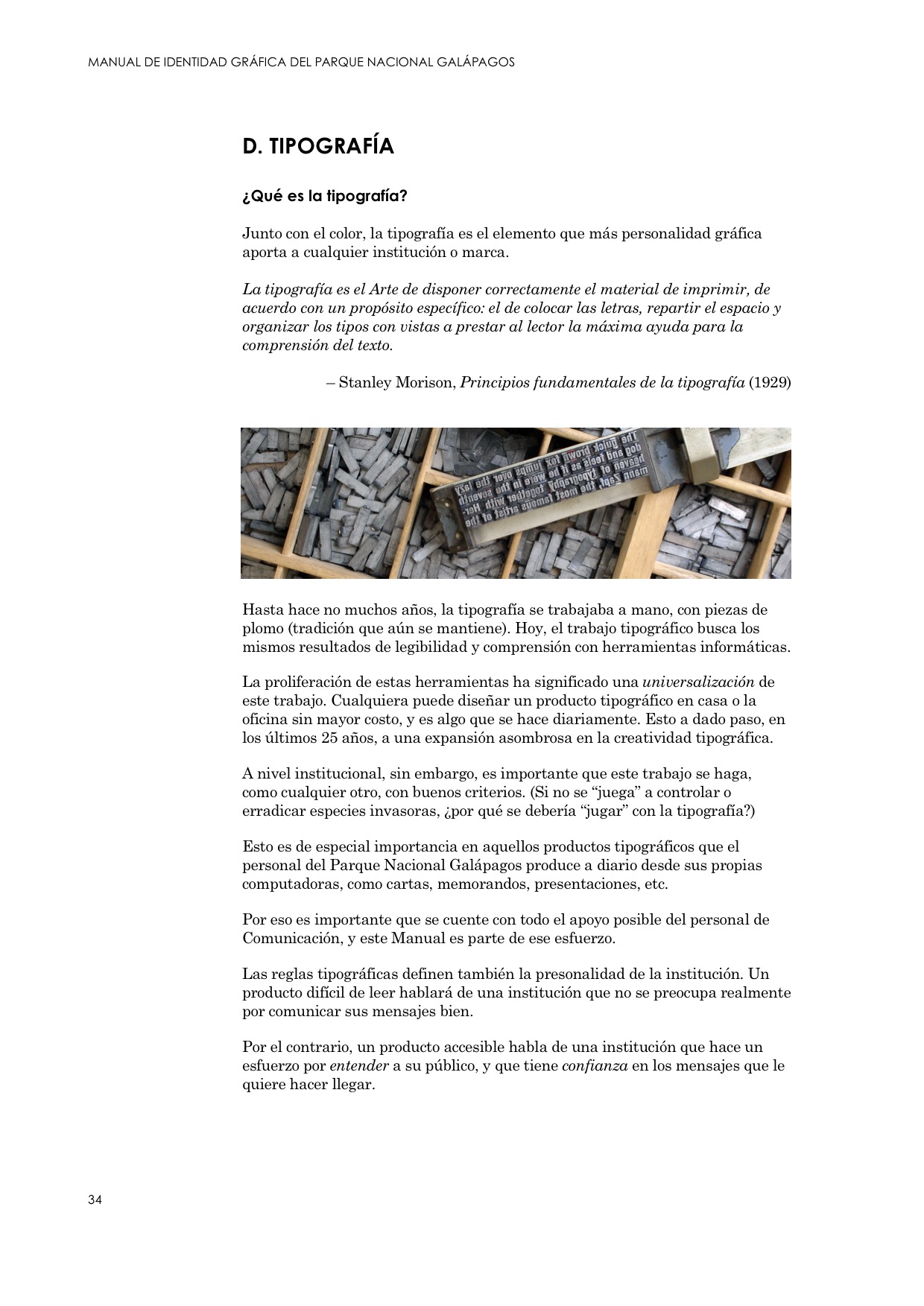
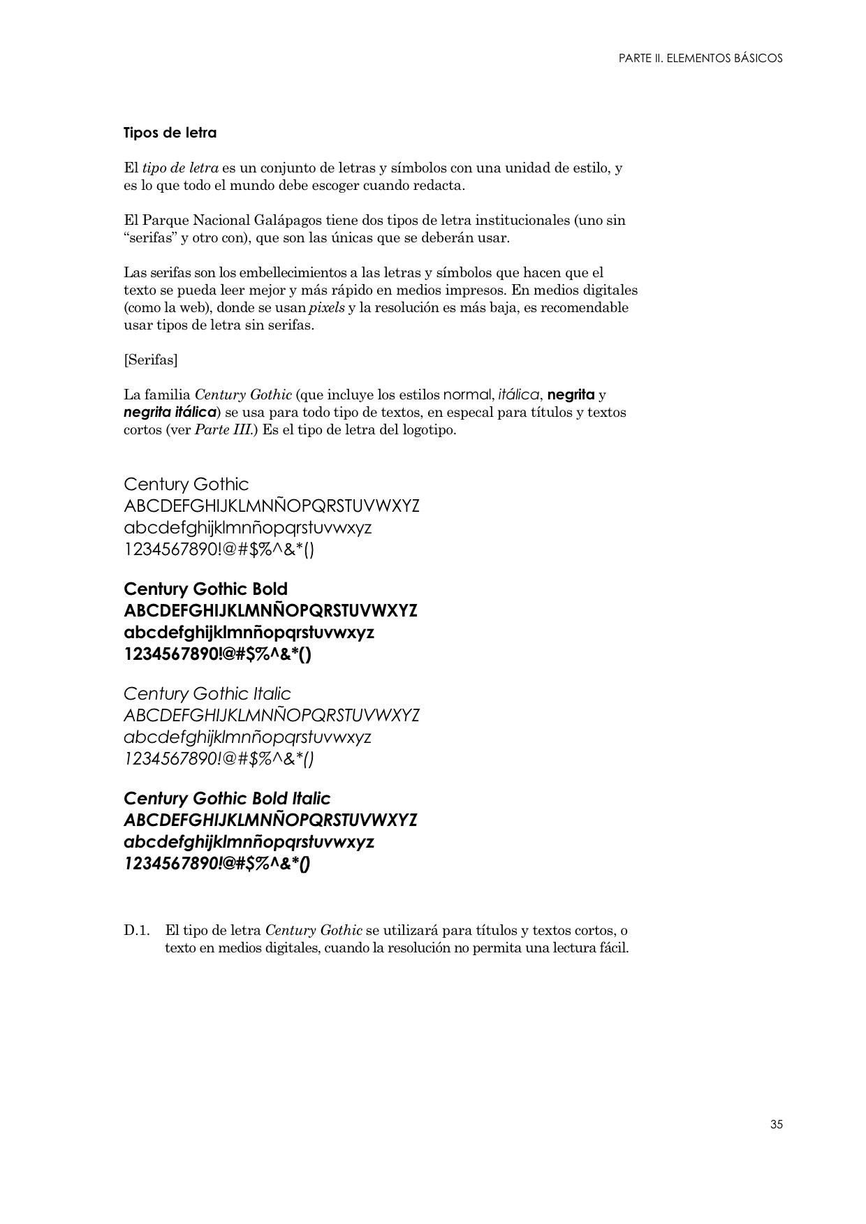
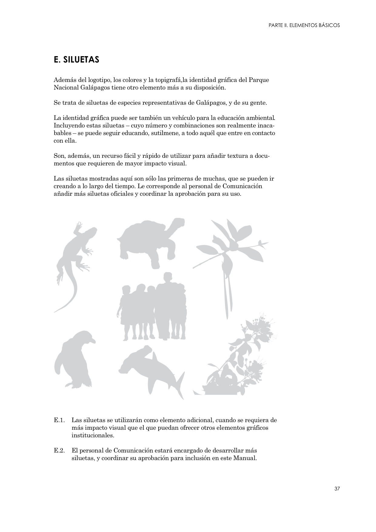
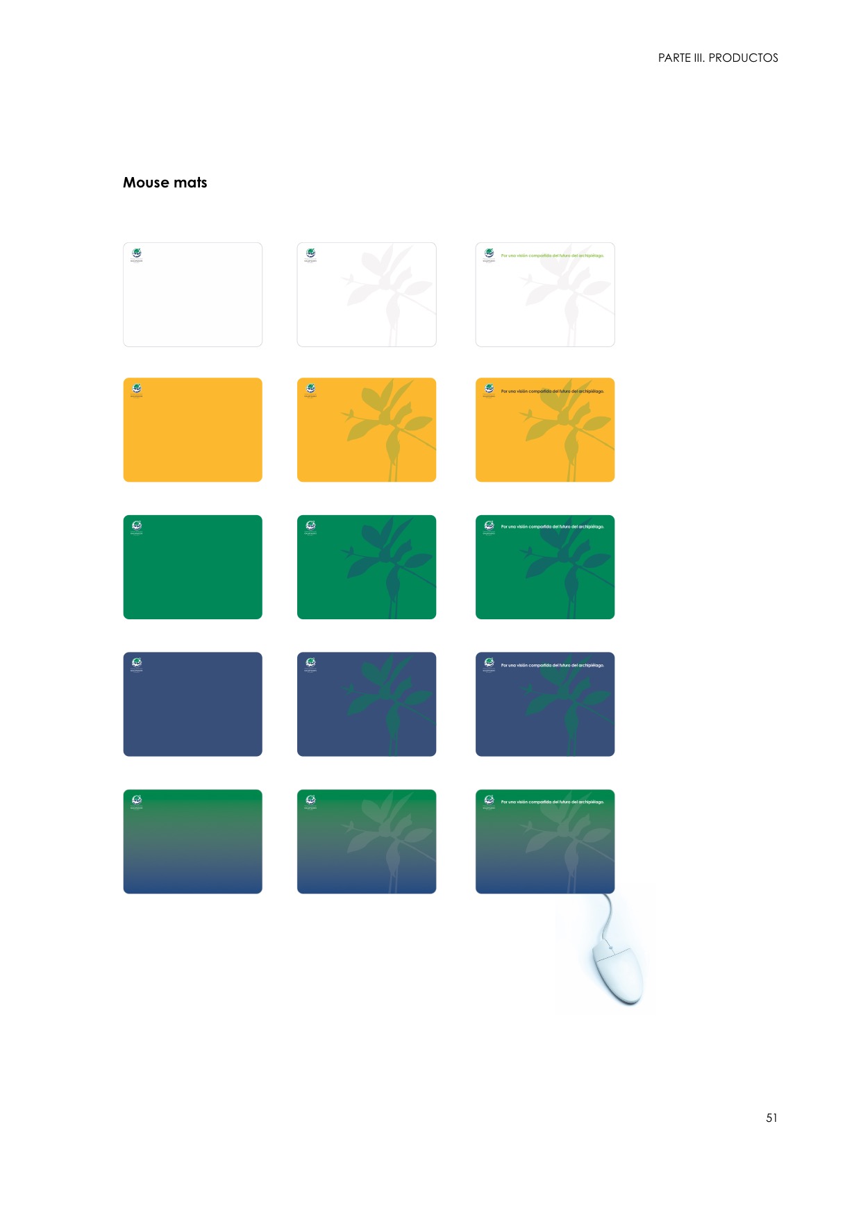
I worked on typography, layout criteria, use of backgrounds, colours and motifs to define a set of basic elements with which to build any piece of visual communication, in any medium.
Unlike most identity manuals, which often introduce a brand new image, I decided to produce this one after I had developed the new image in practice, through a number of products.
Brand Research
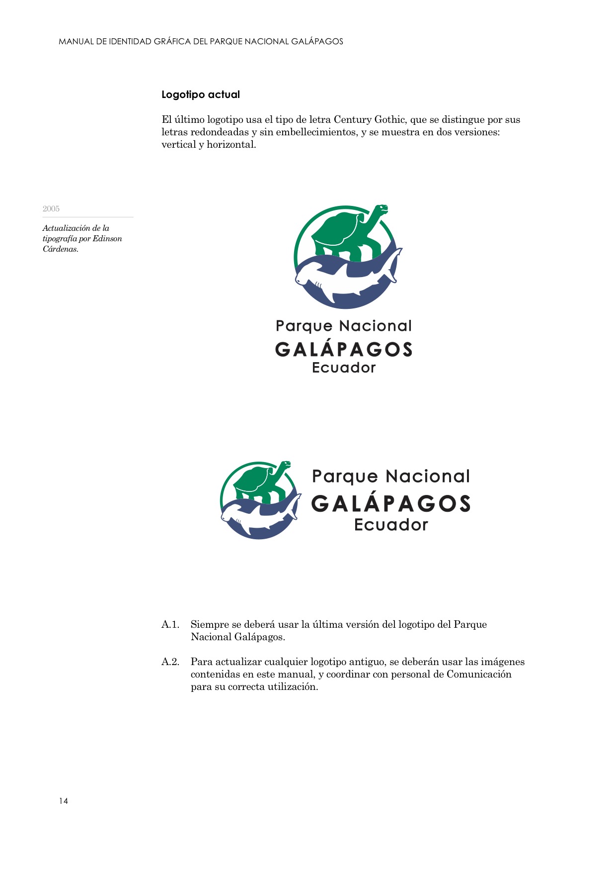
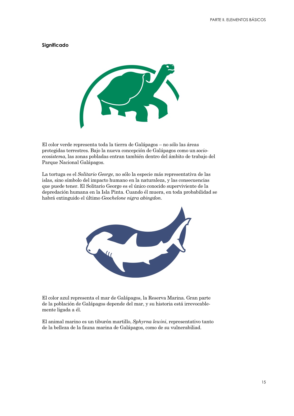
A look at the Galapagos National Park’s corporate identity through the years, from no logo in 1971 to the current logo.


Selected Content
